A fantastic game
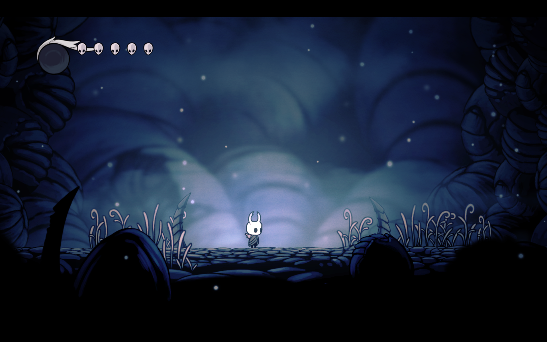
Hollow Knight by Team Cherry is likely my favorite video game of all time. The game is a work of love made by a small team of developers, and every aspect of its 40+ hour gametime feels hand-crafted and personally thought out. The color design in this game is no exception. See below the very first screen you see after beginning a new game. The low value deep blues and pale white glow create a feeling of solitude and calm. It is not immediately intense, giving the player ample time to explore the intuitive controls and comprehend the scope of the world. It does far more by showing rather than saying, and I love it for that. The color scheme is monochromatic, but the stark contrast in values placed next to each other (known as chiaroscuro), which helps give the feeling of depth, making the game feel more vast.
Starting off simple
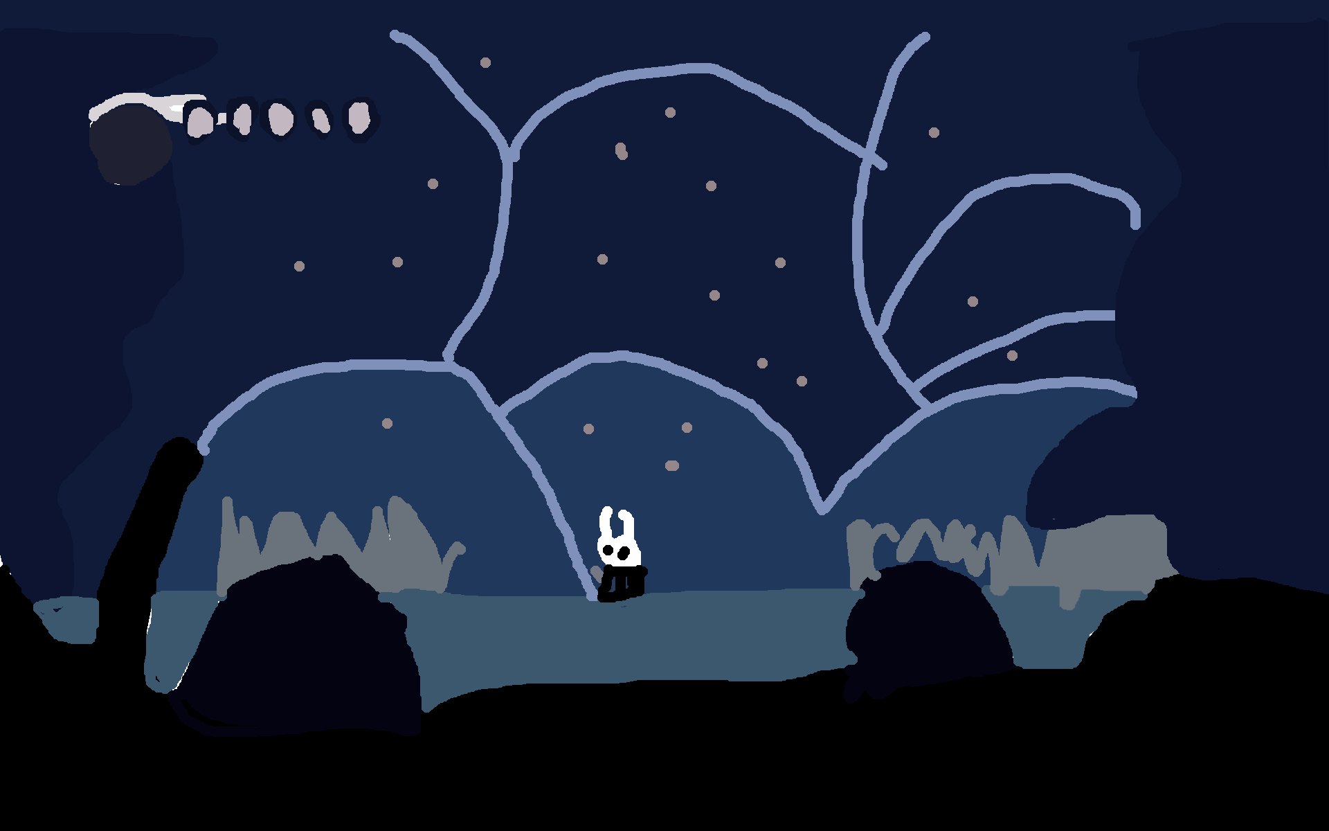
Today, I would like to take a bit of a look at how the color scheme of this iconic scene can be modified and adapted to fit different design goals and aesthetic wishes. See below my *very high* fidelity model of the first scene. This is a great starting off point, but I think we can do a little more.
Switching it up
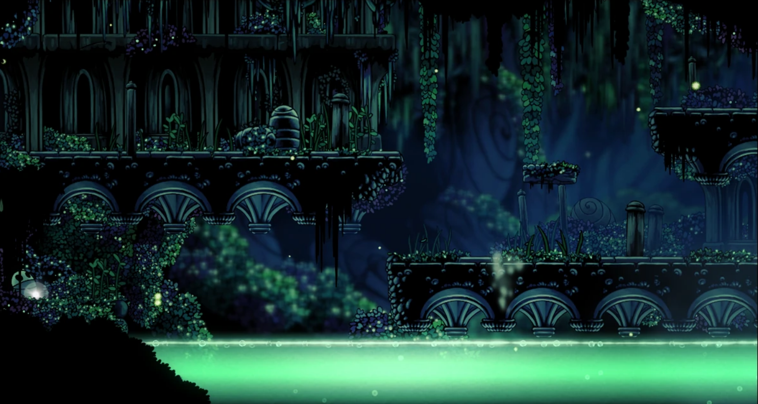
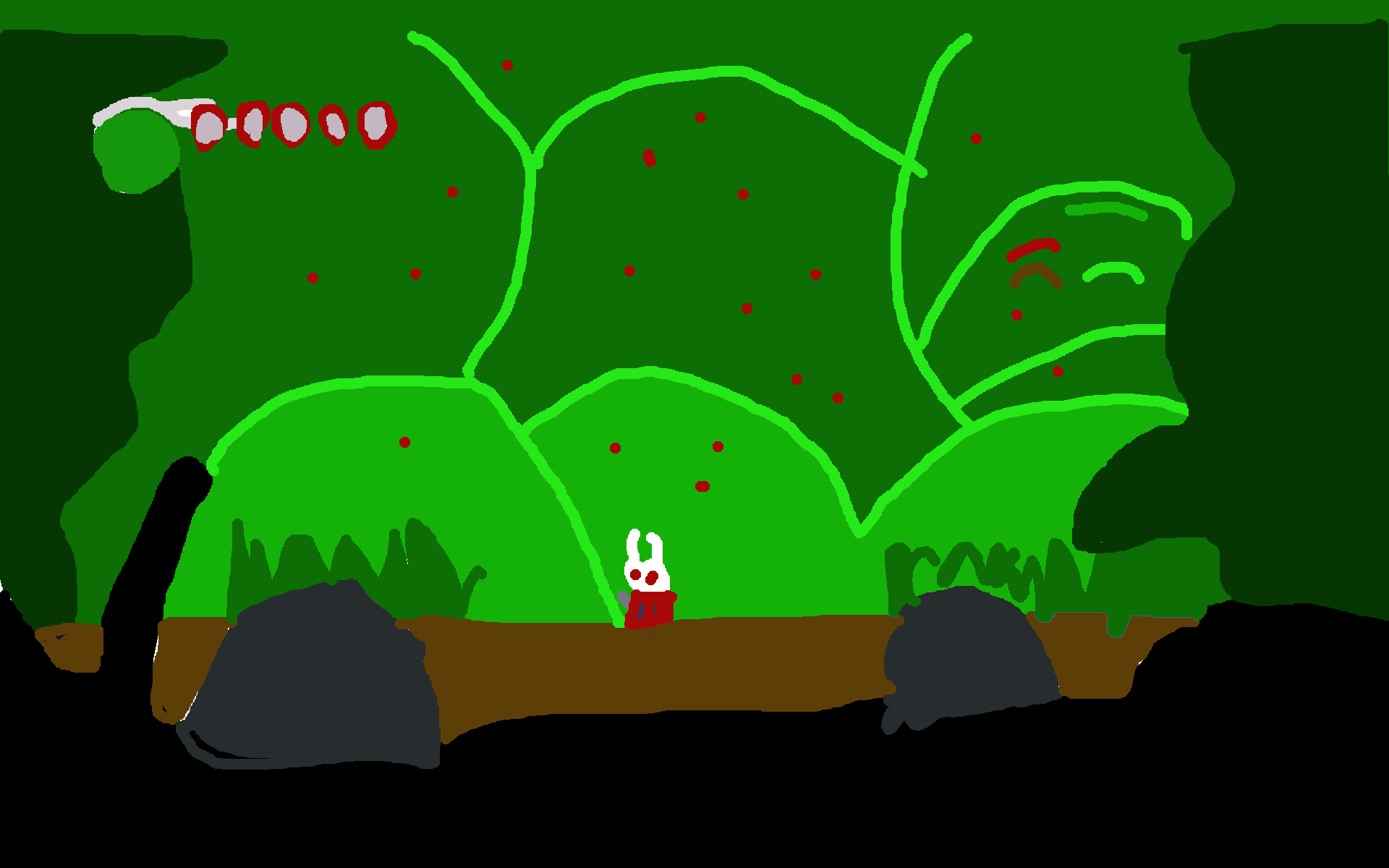
My first idea for how to switch up the color scheme is to go from a muted blue to a more vibrant green. Hollow Knight is known for its fast world, and what a better way to communicate this than through an immense amount of greenery? The use of monochromatic greens establishes a clear and coherent sense of nature, and the slight touches of red in the eyes of the Knight leverage complimentary colors to immediately grab the viewer's attention. Red is aggressive and loud, and the high saturation of the hue emphasizes this feeling. It feels more dangerous than before, like there is something lurking around the corner.
Going for a different angle
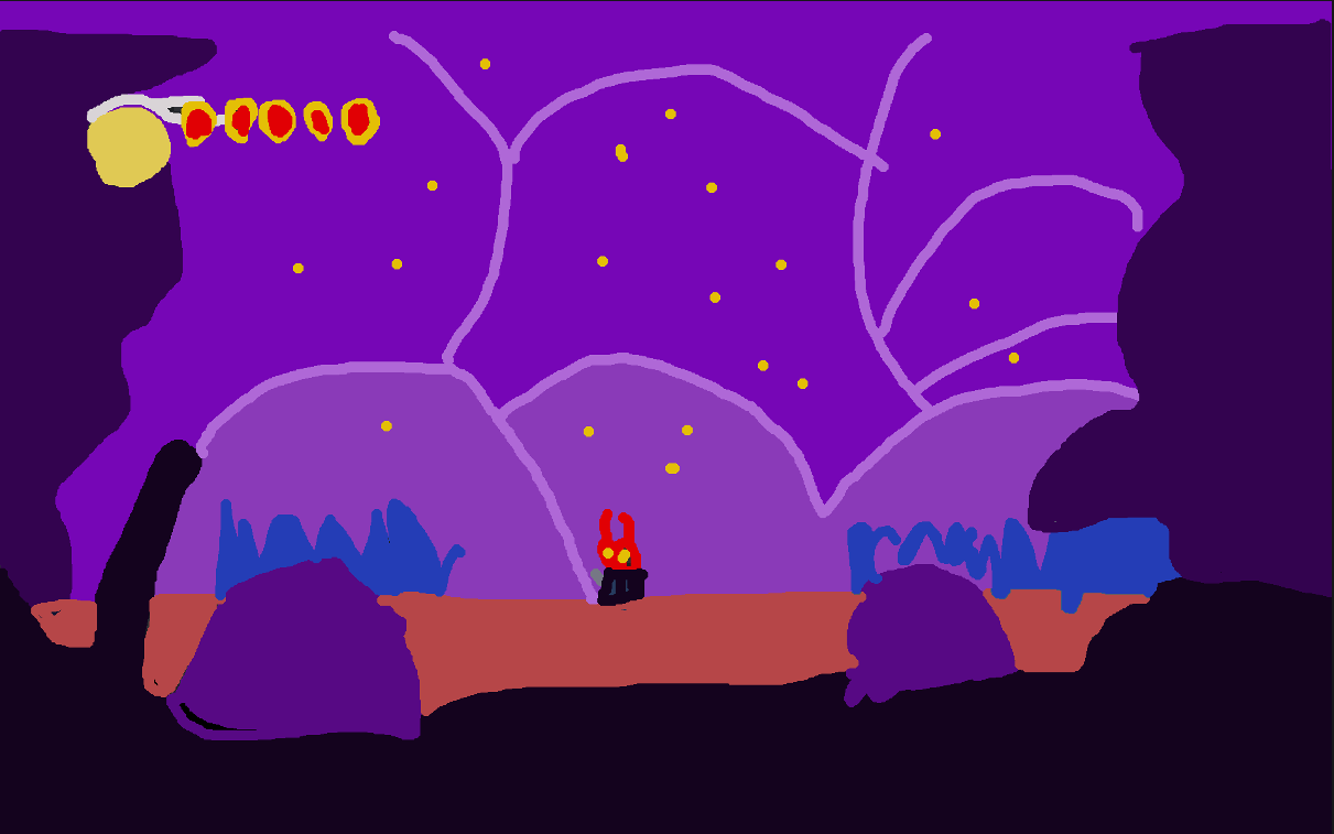
Green forest with a touch of red is rather commonplace in a lot of games, but Hollow Knight could also experiment with some more bold color choices. The land of Hallownest is a land of magic, and I felt we could lean into this much further with a healthy combination of purples and blues. The use of analogous blue and purple creates a larger breadth of moods than the original monochromatic colors, and the cool colors coupled with a smattering of high saturation yellows help to develop the magical atmosphere. Overall, this layout feels much more out there and mystical than the angle the game is consistently going for, although it would definitely be an interesting direction.
A full 180
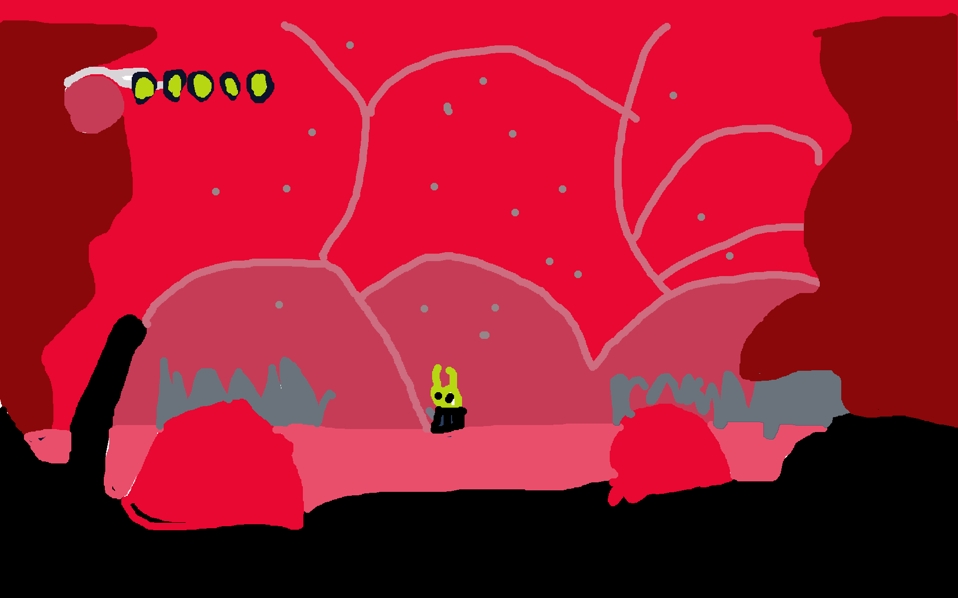
This game is hard. It took me more hours than I'm proud of to beat, and it does not hold your hand in terms of difficulty. Let's lean into that; welcome to HELL! High saturation reds with varied value are very internse and in your face. Monochromatism is not here this time to create a feeling of simplicity -- it's here to let you know that there is no escape no matter where you go. The yellow of the knight is not in line with many comon color schemes, causing them to stand out. They do not belong here. They need to do something about it. The road ahead is dangerous.
What have we learned?
Overall, I am still in love with the original deep blues the game loves to use, but if I were to make a switch, I would probably go with my green theme. I feel the natural vibe goes well with the game's goals and scope, and I was quite pleased with the way it turned out. Coincidentally, I realized the game actually already leverages a design much like this in the later level of Greenpath. It seems great minds think alike! It captures the intended mood very well.