A Tale of Information Overload
Do you have any idea how cheap a cruise can be? Do you know how to book a cruise and how to find the best one? For most people, the answer to those questions is no, and I was absolutely shocked to find just how incredible and economic it can be to go on a cruise for a vacation. So I went online trying to find a good place to book a cruise and immediately my excitement turned to frustration. There is very little in the way of actual solid cruise finder websites, and existing options like Cruise.com are incredibly bloated and leave much to be desired. All the information they throw at you is overwhelming and 99% pointless. I ultimately left the site cruiseless, upset about the whole experience and feeling as if there's some major barrier to entry whenever trying to book one on my own.
...And That's Where We Come In!
My good friend Blake and I decided that right now, the status quo for cruise booking is simply unacceptable. We're both computer science students who know a thing or two about User Interface Design, and we figured we could do better than what there is out there right now. Entering a new business partnership, we collaborated on the work on our new and upcoming project. Acknowledging that we both still had a lot to work on in terms of personal skills, we opted to make the entire creation process collaborative. Everything you see discussed in this narrative, unless otherwise noted, was either made together or was directly critiqued and modified by the other person during conception. My role in each component was just as much mine as it was his.
Enter: Contour Cruises
Contour Cruises, our solution to the problem discussed above, was ultimately an idea inspired entirely out of spite and frustration, which isn't necessarily a bad thing. Sometimes
it takes a little less-than-kind push to get someone to get up and actually make something useful. We're not the design team the world deserves -- we're the design team the world gets,
because someone needs to fix this issue. We decided to opt for a website designed primarily for desktop, as booking a cruise is a substantial and costly decision, and we determined in our
early interviews that this is something customers would like to be sitting down for. We created an archetypal customer profile for our story of imagining someone using our product, based loosely
off my own experiences. Here's the story of Christopher Shipley:
"7:00 PM, Sunday night, Spring. Chris is a senior at UC Berkeley studying Finance and Computer Science, and he’s never been on a cruise before – nor wanted to – until he saw an ad on YouTube for one.
Can they really be that cheap? Surely, it’s too good to be true. Looking for an end of college trip, he decided that he might as well take a look and see if this is real.
Going onto our website with scrutiny, Chris is interested in two things: price and assurance that the cruise he is signing up for is actually a high-quality
experience and not some run-down rust boat.
When he logs on, he is greeted by a modern logo and taskbar, but his eyes are immediately drawn to the search tool covering the majority of the screen.
Inputting his requirements (Trip in May 2023, party of 4, departing from the San Francisco area, 5-7 days, and under $1000), he is greeted with a list
of cruises to his liking. He spots a 7 day Alaskan cruise for a relatively low price (and an open bar which is definitely an added plus) and decides to
investigate further. The page assures him that all the fees and taxes are included in that price, and he could book that cruise today for $867.
Content with the price, he goes to investigate a little further. For about $100/day, how good could this ship really be? Spotting an option to view an
interactive map of the ship, he is shown the 12-deck vessel in all of its glory. 8 restaurants, 2 spas, 4 cocktail bars (with bottomless Mojitos!), and
a room that, while not very spacious, would definitely house a man such as himself for a week. He clicks on the bar, where he is able to view their hours,
some photos taken of the interior, as well as more specifics on how that open bar actually works. He then goes to explore the restaurants, where he is
shown samples of what the typical menu looks like, as well as some pictures of food. Chris becomes more confident that he is not being scammed and
that this indeed is a worthy vessel for his end-of-college celebration. Satisfied, he goes to purchase tickets, where that cruise price does not
go up a single cent. The experience was painless, he got his information QUICKLY and ACCURATELY, and he did not feel he had to make any difficult
decisions attempting to find this cruise."
While I couldn't find the space to include it here, we also had a separate story outlining Chris' afinity for engineering and taking a closer look at Contour Cruises'
ship view. What we sought to capture with these stories is how Contour Cruises should FEEL. Understanding what a customer says and does is simple, but what they think
and feel is much more difficult to pin down; designing our system with a central idea in mind makes this much more streamlined.
Early Development
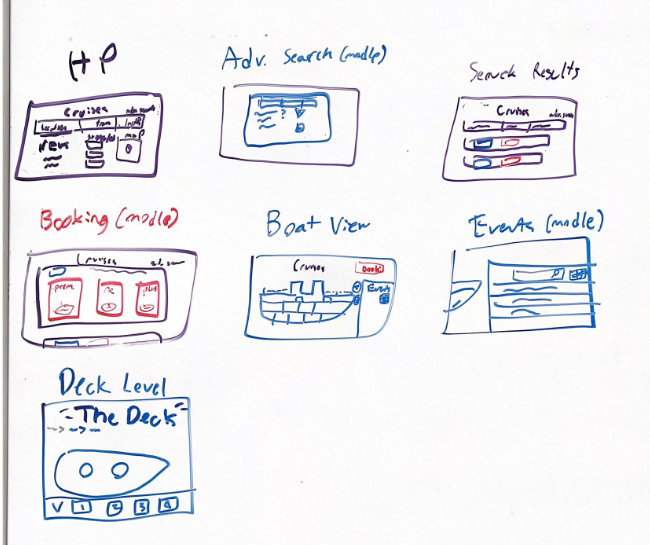
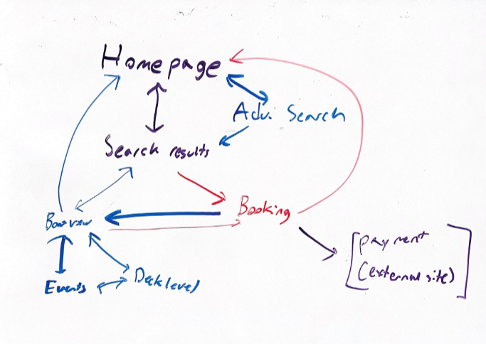
Once we had the feel and use of Contour Cruises down, we began to get to work on some rudimentary sketches and diagrams. At this point in the process, we were concerned with how all the different pages would go together, what key design feautres there would be, what each page would look like, and what is necessary to accomplish all of Christopher's goals. The entire point of our website is to minimize bloat and fluff, so we tried to keep these sketches as simple as possible without sacrificing efficiency. Check out some of our interaction and sketch diagrams below!
A Design System is Born
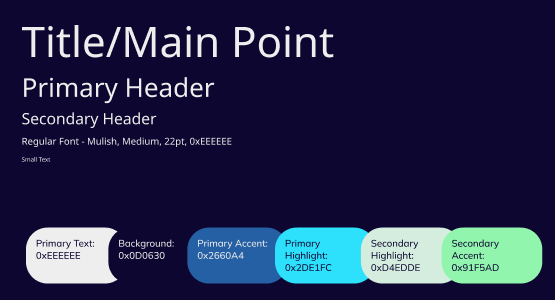
After we had a good set of sketches and ideas on paper, it was time for the fun bit: putting it all into the computer! We started with what separates a good UI from a great one: a solid design system. We wanted our website to feel sleek and minimalist while maintaining all the readability and information a cruise booking service would need. Naturally, we spent a lot of time picking out a solid color scheme and font, and I'm honestly really happy with it turned out. Rather than black and white, we opted for a slightly off-white tone and a deep purplish-blue backdrop for all of our pages. We felt these colors made the site feel much more rich feeling while staying easy on the eyes. The cool tones in the background naturally invited some lighter blues and greens for our accent and highlighting colors, which we implemented in the design system as well. Our font, Mulish (later changed in revisions), was sans-serif and easy to read while still looking professional and modern. Each font size was based off the previous smaller size, multiplying it by the golden ratio.
Putting it Together
Once we had our design system put together, we turned our sketches into a reality, creating a mockup of our interface and turning that mockup into a more well-fleshed out and interactive prototype that can be found below. Whenever a user enters our site, they are brought to a homepage featuring some recommended deals and a large search bar with the option for advanced search. After inputting their search results and finding a cruise they like, users are transported to a cruise-specific page giving more details about the cruise. From there they have some options. They can click on a link to an external ship view, courtesy of the specific cruise providers themselves, book the cruise, view different pricing options, or view a detailed itenerary or list of features for the cruise. At any time, users have the opportunity to go back to where they left off, navigating via breadcrumbs or our clickable logo returning them to the homepage.
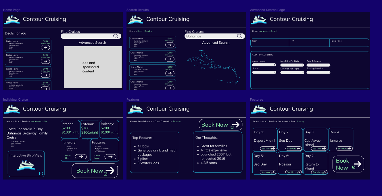
Our first Prototype!
We Got Work to Do!
At this point, we felt it time for a fresh set of eyes on our prototype. Showing our design to some of our colleagues, we came to some quick realizations in terms of our prototype. It was confirmed that our color scheme knocked it out of the park. The visual appearance and minimalist design of Contour Cruises was our biggest strength, which we were really happy about considering that was the entire point of creating our design. There were, however, some glaring weaknesses. The purpose of the site is unclear to a new observer, and some of the text was quite small or felt out of place. We had to refine our website to have more direciton, adding in a mission statement blurb to our site, correcting some of the text bigger, and fixing other miscellaneous pieces of feedback so it looked better as we moved to a broader audience.
User Testing Begins
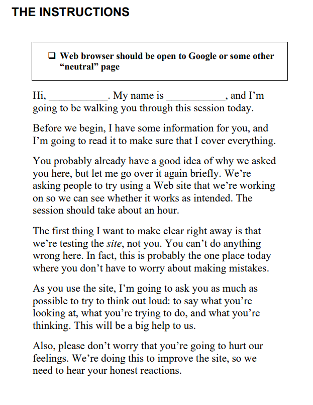
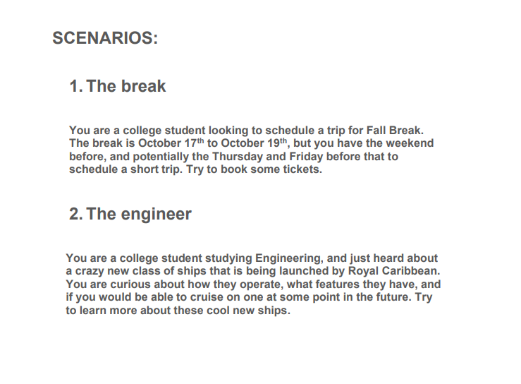
It was time to get some more thorough feedback in the form of user testing. We sat down and ironed out a formalized procedure for how we would run each showing and then went out and performed testing. The beginning of each test was to follow a pre-set script, and the users would be given a set of two tasks we feel would be commonly accomplished while using Contour Cruises. Below are some blurbs from our introduction and scenarios we gave each of our users.
Proper Procedure Yields Quality Results
The individuals we tested primarily consisted of college-age students who had a similar story to Christopher's. Some of them were fellow computer science majors and others were less tech-
oriented. We identified two key themes throughout our interviews. First, many felt the website felt unprofessional or untrustworthy. This was in part due to the borders of the site
but also because of the font we had used earlier. As one interviewee put it, it felt too "Google Docs". Second, there was the issue of understandability and ease of access. Many users
failed to complete the first task and were frustrated with the lack of clarity on the advanced search and its results.
Following our analysis and regroup, we ultimatly decided to correct the following 5 issues:
1. Results of an advanced search should be more explicit and the button for advanced search should be more obvious (fixed by creating a specific page for advanced search and
throwing a border around our advanced search button)
2. The borders on the site felt a little janky and busy, to where they strained the eye a little (fixed by lining up all the borders around the site and making them more consistent)
3. The font looks unprofessional and led the user to feel untrusting towards the site (fixed by going back to the drawing board and workshopping a new font, ultimately changing to
Nikukyu)
4. Clicking on the search glass doesn’t search (fixed by updating the search glass to be clickable)
5. Advanced search has both an ideal price option and a min/max per night option and it’s not clear which does what (fixed by adjusting the advanced search options on its page)
We decided to correct these changes due to a combination of how they worked well with each other and how pressing we felt they were in terms of our design system. The advanced search and font
changes in particular we felt were incredibly important in fixing the above issues of professionalism and ease of access.
Contour Cruises Post-User Testing
Reflecting on Values
All in all, I was quite happy with the way Contour Cruises turned out. It still has a long ways to go before we are able to ship to market, but the idea and spark is definitely there. When we set out on this project, we determined early on that the two key values for our website would be Honesty and Respect, which we feel we kept consistent throughout the design process. The primary issue with current cruise booking sites is that they don't value the customer's time or their own integrity, doing anything they can to force a sale or sneaky price mark up at the last second. Contour Cruises is a zero bull**** site that does everything it can to avoid lying to or disrespecting the users. Users consistently were pleased with the layout of the site and how nothing was hidden from prying eyes. It's a product for the buyer, not for the seller. I hope to take what I learned working on Contour Cruises and applying to my other projects. With proper planning and forethought, anything is possible!