A New Idea
This week, I wanted to switch it up a bit and find new ways to get inspired for my designs, so I decided to visit a nearby art museum and really dive deep on a piece I found there that spoke to me. Enter Pat Adams' It Comes To This. Known for her "galactic works" that allow the viewer to really get lost in the piece while remaining grounded by the interspersed geometry, her 1978 It Comes To This takes Pat's usual work and turns it up to 11, with an absolutely massive piece that dominates the user's entire field of view. It really inspired me, and I'd like to take some time to talk about all the cool stuff that's going on here.

Direction of the Eyes
The first thing that stands out to me about this piece is simply how my eyes drift across the massive Canvas. Ahmen Hussam's article on "Visual Direciton in Web Design" outlines how images can be used to control where the user's eyes go. While the entire piece is an image, there is background and there is geometric components, and those triangles, squiggles, and lines tell my eyes where to wander next. In my own interfaces, I can make easy use of this by incorporating my own visual components, helping to ease my user's focus to where I want them to go.
Understanding Scale
I could not discuss this piece without mentioning the sheer size of it, as I feel this feature is just as important as the content of the art itself. Such an ambitious work would not work on a regularly-sized canvas, and it simply would not evoke the same feelings. Ian Reynolds has a fantastic article on this principle, discussing how UI designers must be mindful of the scale their creations will be seen in. It's not just a matter of readability (which is obviously still important) -- it also changes the emotional response a user might have. I'm in a different mental state and process information differently when I use an iPhone (faster, less controlled environment) versus when I'm on my computer (controlled, often more contemplative and deliberate).
The Power of White Space (Components vs. Background)
UX Engineer quotes Mozart's famous “The music is not in the notes, but in the silence between," and I quite frankly don't know if I could say it better myself. If It Comes To This. was just a giant mish-mash of shapes, there is no way I would be able to follow, and a plain background would just be boring and uninspiring. It is only by balancing both together that the piece is able to touch its viewers and make you feel so enraptured with it. This is analogous to whitespace in my own UI's, giving the user a reprieve from all the noise to digest the page and distinguish one section from another.
Turning to My Own Work
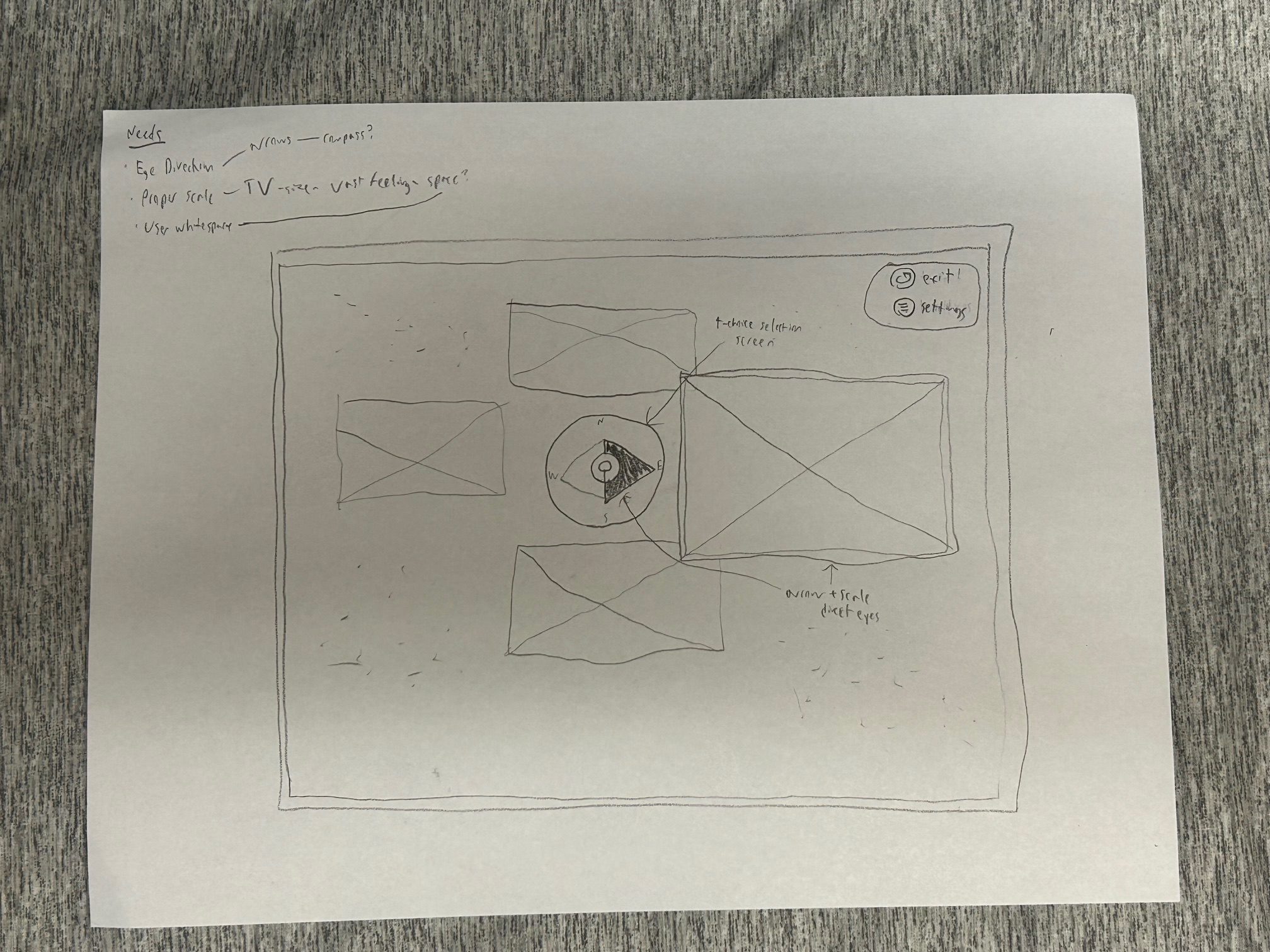
Taking what I've learned from Pat's fantastic artwork, I decided to do a very QUICK sketch of something I've been wanting to take a crack at for a while, which is a TV interface,
incorpoating some of the principles we've just learned about. Below is what I ultimately came up with. I wanted to make a home menu that, when you own a big TV, makes you feel like
you own a big TV. It should be epic, grandiose, and vast -- almost exactly how It Comes To This is. I went for a circular navigation style, ripping
the compass arrow straight out of Pat Adams' piece and taking advantage of the massive size of the TV, as all that real estate makes some clunkier more
avant-garde styles still show up effectively. Instead of filling up every inch of that screen, I decided to use a galaxy theme to make the area feel more vast, with
helpful indicators of how to get out of the navbar.
All in all, this was a very enlightening experience, and I enjoyed seeing what more professional artists do to help capture the viewers attention and express a message.
It's been interesting realizing how much the world I am now starting to see through a UI/UX lens as I wander about, and I hope to draw more inspiration from my surroundings
in the future. The world is your learning experience.
Credit
Adams, Pat. It Comes To This. 1978, The Sheldon, Lincoln, NE, USA.
Ahmed Hussam, 4-13-2012, "Visual Direction in Web Design," Web Design Envato Tuts+, https://webdesign.tutsplus.com/visual-direction-in-web-design--webdesign-2545a
Ian J.H Reynolds, 12-8-2020, "What Is UI Scale: How it is Being Used in Web Development?," Custom Software Development Insights | Zibtek Blog, https://www.zibtek.com/blog/what-is-ui-scale/
UX Engineer, No Date, "Principles of Design: White Space - UX Engineer," https://uxengineer.com/principles-of-design/white-space/