Design Systems are not easy
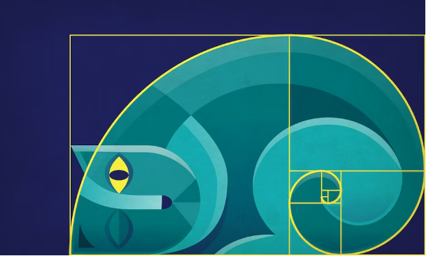
Recently, my friend Blake and I have been planning to put together a design system for our idea for a new web-based cruise finder interface, and we quite frankly don't know where to begin. We've made graphics before, but we wanted to try doing it like a professional would this time -- creating a standardized library of components for our project. To get a little bit of background, we decided to watch soem tutorials from the wonderful team over at Figma, and I personally was both bewildered and pleased by the amount of intention that goes into details as small as how much each font size will vary relative to each other. Did you know that many developers use the golden ratio or musical harmonics to scale their fonts? Crazy!
Everything is carefully planned
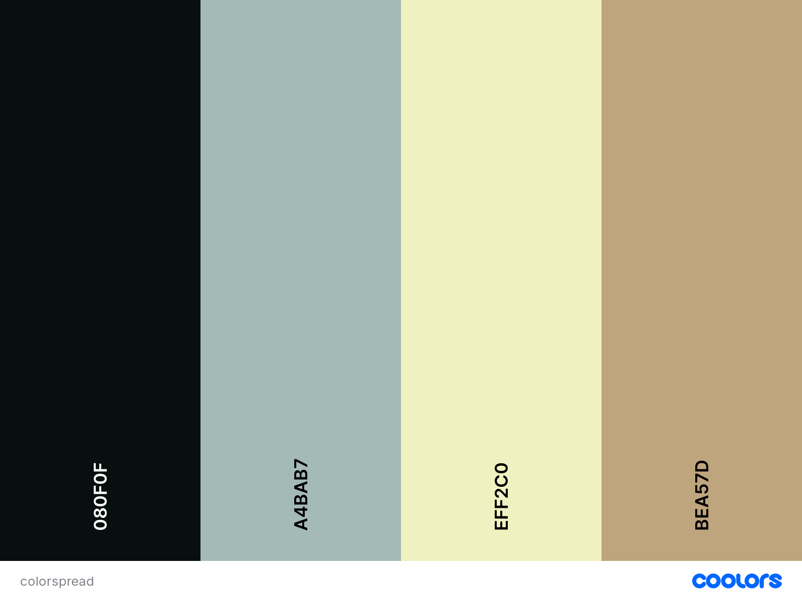
Font is not where the attention to detail ends. Above is a color pallete I generated myself using coolers.co -- in a professional design system, you would have defined uses and names for each color inside of your interface. Primaries, secondaries, accents, and base darks and lights are key to having a well-fleshed out color system. We plan to do the same thing for our own personal project once it's time to get down in the weeds. There are no accidents where we are going -- every aspect of our UI's and graphic choices will have a purpose, creating the best possible user experience.
Credit
Design System Tutorial
https://coolors.co/